

Towards Inclusive Documentation: the PyData Sphinx Theme, Before and After Accessibility Fixes
Published September 2, 2024


gabalafou
Gabriel Fouasnon
Image credit: Illustration by Sherm for Disabled and Here (image source, image license)
Towards Inclusive Documentation: the PyData Sphinx Theme, Before and After Accessibility Fixes
Over the past several months, I and a few coworkers at Quansight Labs have had the privilege to work within the PyData community to make some accessibility improvements to the PyData Sphinx Theme. For this blog post, I chose three such improvements (out of many!) to examine with a before-and-after lens. This will give a better idea of how these kinds of changes can create an improved user experience for disabled people—and often for people without disabilities, too.
For those not familiar with Sphinx, it is a framework for writing documentation. It is used, for example, to generate the official Python documentation. As with many such content generation frameworks, Sphinx supports customization via themes. One such theme, created by and for the PyData community, is the PyData Theme. For those not familiar with accessibility, it is the practice of adapting built environments (including digital and virtual environments) to meet the needs of disabled people.
Before we begin, there's an important clarification to make. Throughout this blog post, I will use screenshots from the PyData Sphinx Theme documentation (v0.15.4), which uses the theme; however, I want to emphasize that these improvements apply to the theme itself, and by extension to all documentation sites that choose to use it, such as the ones featured in the PST gallery.
This work was supported as part of a two-year grant from the Chan Zuckerberg Initiative.
Landmarks, Before and After
This section assumes that you know what a screen reader is.
If you are a sighted person, then when you visit a website, you are used to
seeing the content arranged in a limited number of ways: typically, a header, a
main area, a footer, maybe a sidebar. Visual cues like alignment, horizontal
lines, and font sizes all work together to help your eyes and brain to scan the
page to know where to look. But if you are a blind person, you rely on landmarks
to fulfill the same function. HTML5 provides tags like <header>, <footer>,
and <main> that allow web page authors to break up the content on the page
into meaningful sections. These sections can then be surfaced to screen readers
and other assistive tech.
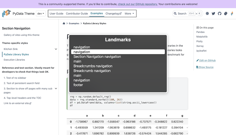
Screen reader software provides a way to quickly cycle through all of the landmarks on the page. The following screenshot shows the landmarks as they appeared in the macOS VoiceOver rotor before we fixed them. Imagine trying to make sense of a website if you cycled through its landmarks and heard the following:
navigation, navigation, Section Navigation navigation, main, Breadcrumbs navigation, Breadcrumb navigation, main, navigation, footer
Confusing, right?
To be useful, the set of landmarks needs to be short and unambiguous. There should be one and only one landmark for the main part of the page, just as there should only be one header and one footer. It’s okay to have multiple navigations, but they should be clear and distinct from each other.
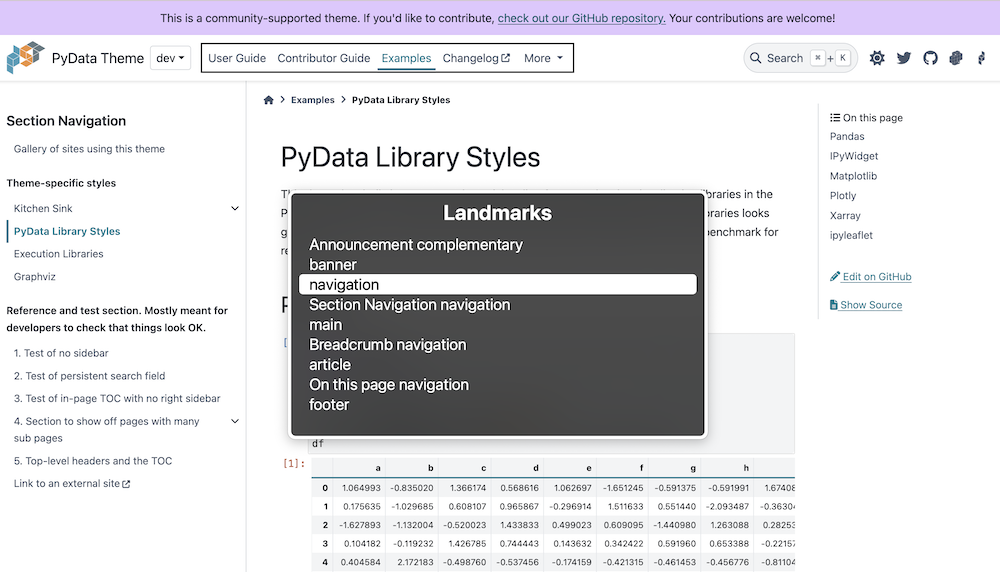
The next screenshot shows the same view with the landmarks fixed. If you read the following aloud, can you now make sense of the page?
Announcement complementary, banner, navigation, Section Navigation navigation, main, Breadcrumb navigation, article, On this page navigation, footer
Still a little bit of cleanup to be done, but much better, right?
If you’re curious about how we did this, you can check out my landmarks pull request on GitHub. Here’s also a short list summarizing what I did:
- Since the theme already had a
<main>tag, I removed therole="main"attribute from the<article>tag - Wrapped the header in a
<header>tag (landmark = "banner") - Got rid of nested
<nav>s - Put the announcement banner in an
<aside>tag (landmark = "complementary") - Used
aria-labelandaria-labelledbyattributes to label some of the landmarks (for example, to disambiguate one navigation from another)
Community feedback was key. I did not realize when I removed the role="main"
attribute that Sphinx uses the corresponding
[role="main"]
CSS attribute selector to highlight search results when a reader searches a
Sphinx-generated documentation site. But one of our user-contributors, Michael
Wisely, reported the missing
search highlight on
GitHub. Then maintainer Daniel McCloy connected
the dots. The fix was fortunately straightforward. It just required redundantly
adding the role attribute to the main tag, like so: <main role="main">. (But
don't do that on your own website! You can and should just use the <main> tag
without the role attribute.)
If you're curious about how I generated the screenshots in the pull request that I linked, or if you're curious about how your own website looks in terms of landmarks, you can download a browser extension like WAVE or Accessibility Insights. These extensions provide a way to view all of the landmarks on a web page at once.
Sidebar Table of Contents, Before and After
This section assumes some knowledge of HTML and CSS.
A crucial part of web accessibility is keyboard accessibility. This means that users should be able to use your website without a mouse or touch device—in other words, with only a keyboard. Full keyboard access essentially provides an input API to your site. Different kinds of assistive tech can hook into the same interface intended for keyboards. (There is a nice historical continuity here as some of the first typewriters were assistive tech.)
The PyData theme provides a table of contents in the left sidebar. One nice feature of this table of contents is that site authors can choose how many nested levels to show before the sublevels are hidden automatically beneath an expand/collapse button. The only problem with this button, though, was that it was not keyboard accessible.
In fact, the button wasn't really a button. A true HTML <button> is keyboard
accessible, meaning that a user can both navigate to it using the Tab key
and operate it using the Space, Enter or Return keys. But our
foldable/unfoldable table of contents had been implemented without HTML buttons
to avoid JavaScript. It used two tricks in a clever way:
- In HTML, if you associate a
<label>with an<input type="checkbox" />, then clicking the label checks and unchecks the associated checkbox. - In CSS, you can select a checked checkbox using the
:checkedpseudo-selector.
You can then use CSS to always hide the checkbox and to selectively fold or unfold the next level in the table of contents based on whether the checkbox is checked. In code, it looks like the following:
<li> <!-- table of contents entry --!> <a href="kitchen-sink">Kitchen Sink</a> <!-- checkbox hidden via CSS --> <input id="toc-checkbox-1" class="toc-checkbox" type="checkbox" /> <!-- label associated with checkbox --> <label for="toc-checkbox-1">🔽</label> <!-- next level of TOC --> <ul> <!-- ... --> </ul></li>
/* Always hide the checkbox */.toc-checkbox { display: none;}/* When checkbox is not checked, hide the next level of the table of contents */.toc-checkbox ~ ul { display: none;}/* When checkbox is checked, unhide the next level of the table of contents */.toc-checkbox:checked ~ ul { display: block;}
The tilde (~) is standard CSS, but it's not very commonly used. It's called the
subsequent-sibling combinator. A ~ B means select all B elements that come
after A and are at the same level in the HTML tree. In other words, A and B
share the same parent, and B must be a younger sibling of A.
The problem with this clever, CSS-only technique is that browsers do not treat a
<label> as a keyboard-interactive element; they only provide keyboard
interactivity for its associated checkbox. But the checkbox has been made
invisible, leaving only the label behind, so there's no way to interact with the
checkbox using only a keyboard. Interestingly, even though the checkbox is
hidden, browsers will still transmit mouse clicks from the label to the
checkbox, so that when you click or press the label, it causes the associated,
invisible checkbox to be checked and unchecked. But, to reiterate, the browser
provides the label itself with no keyboard interactivity.
I should mention that I do not know if every browser behaves this way. But I am sure that this was the behavior in Chrome when I was working on this. It's also worth mentioning that screen readers, such as macOS VoiceOver and NVDA, will generally provide keyboard interactivity for the label element in the absence of the browser providing it. But to meet the Web Content Accessibility Guidelines success criterion 2.1.1, this sort of functionality should be operable by the keyboard in general, with or without a screen reader.
So what if you turn the label into a tab stop like so: <label tabindex="0">,
what do you think happens?
Well, it allows you to reach the element via keyboard, but you still cannot
interact with it by pressing Enter or any other key. You cannot check or
uncheck the hidden checkbox this way. So there's no way to make the label
element keyboard-accessible without actually wiring it up with JavaScript to a
keyboard event handler, at which point you might as well just use a button and a
click handler.
This meant that I needed to rethink the way that the table of contents was implemented.
Some of the ideas that my team came up with:
- Use the disclosure widget pattern.
- Use a button plus JavaScript
- Use the tree view pattern
Since I was a little unsure about which direction to take, I decided to ask an expert. Here I would like to a give a big shout out to Eric Bailey. Some time ago I had read on his blog that he was offering office hours as a way to give back to the community. So I sent him an email to ask him if he was still offering. He replied yes and asked me for more info about the problem I was working on, then we scheduled a Zoom call.
One thing I wanted to find out from Eric was whether we should use the ARIA tree role. The conclusion of that conversation for me was that an ARIA role is like a user experience contract, and unless you plan to follow the contract exactly, it's best not to use it. For example, the tree view pattern comes with the expectation that you can expand a node in the tree using the right arrow key and collapse the same node using the left arrow key, so unless you plan to implement those keyboard shortcuts with your own JavaScript code, then you shouldn't use the associated ARIA role.
After the very helpful discussion with Eric Bailey, I decided I would use the disclosure pattern. This made sense to me for two reasons:
- The pattern fits the needed UX for a foldable table of contents very well since its purpose is to hide and unhide content.
- It does not require JavaScript and it is available in all modern browsers, which increases the chances that it will work well across a broad range of devices and assistive technologies.
From there, it was almost a straightforward implementation. 😆
Can you guess what problem I ran into from the following HTML?
<li> <details> <summary> <a href="topics">Topic guides</a> <span role="presentation" class="toggle-icon" /> </summary> <ul> <!-- next level of toc --> </ul> </details></li>
Codepen - Link inside <summary> tag
The issue is that browsers consider everything in the summary tag to be
clickable content that, when clicked, shows or hides the details. But for our
table of contents, the section headings are also pages that we need to link to.
This makes the click potentially ambiguous. Does the user want to navigate to
the opening page of that section or expand the table of contents at that
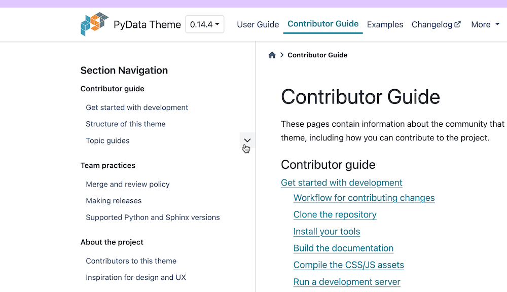
section? It also created an ambiguity for keyboard interactivity. With the
markup above, when the user pressed the tab key, the entire section heading plus
the expand/collapse icon is selected (as shown in the following screenshot). The
user has to press the tab key a second time to focus on just the link. So again,
it's potentially unclear whether pressing the Enter key should follow the link
or expand the section.
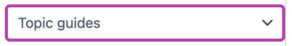
With the help of my designer partner in crime, Smera Goel, we decided that we should present the two elements—the link and the expand/collapse icon—as completely separate. This led to a new, slightly different markup structure, which allows the toggle button to be focussed separately from the section link:
<li> <a href="topics">Topic guides</a> <details> <summary> <span role="presentation" class="toggle-icon" /> </summary> <ul> <!-- next level of toc --> </ul> </details></li>
Codepen - Link outside <summary> tag
| Focus on section title / link | Focus on toggle icon |
|---|---|
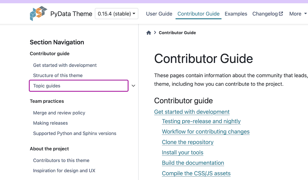 | 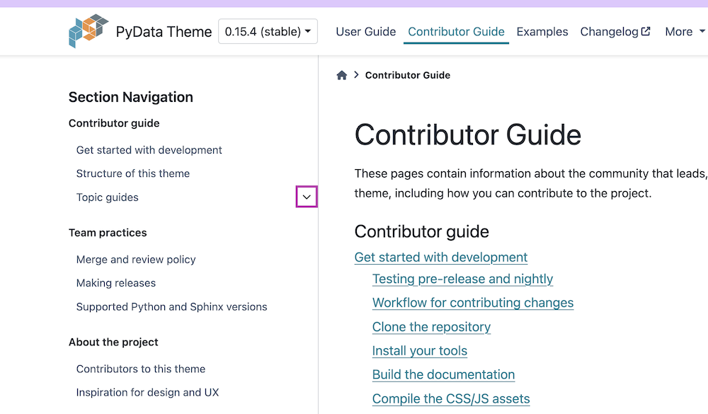 |
The one thing I don't love about this approach is that it is a somewhat unconventional implementation and presentation of a details/summary widget. And let's recall that it was an unconventional use of a standard pattern (label + checkbox) that got us into this mess to begin with. That said, I think this particular variation is okay. I think it may come across as somewhat confusing to screen reader users the first time they encounter it, but I also think the context will quickly make things clear.
At the very least, we know that we have enabled keyboard interaction in the sidebar table of contents where there was none before, and that in itself is a good step forward for accessibility. There's probably room for improvement, as always, which is why we are always eager for community feedback.
Another improvement we made is that prior to this work the toggle button did not
communicate its state (open or closed) to the accessibility
tree. By
using the HTML native disclosure widget (i.e., <details> and <summary>),
this information gets conveyed automatically to the accessibility tree, no
JavaScript needed.
For reference, here is a link to the pull request for this work: Make TOC sections expandable and collapsible by keyboard.
Focus Indicators, Before and After
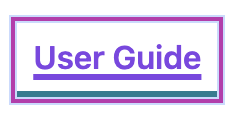
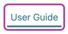
Now that we've had an in-depth look at keyboard accessibility, let's continue on this theme and examine an important aspect: focus indicators. When users navigate a web page by pressing the tab key, they need to know where they are on the page. If they are using a screen reader, it will read out the content at the currently focussed element. But users not using a screen reader need to be able to see some kind of visual indicator of where the focus is. Navigating a webpage without clear focus indicators can be as disorienting as trying to use a mouse without a cursor. By default, browsers indicate focus with a ring around the focussed element. This is what the default focus ring in Chrome looks like:
| Button not focussed (no focus ring) | Button focussed (default browser focus ring) |
|---|---|
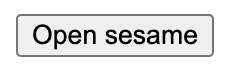 | 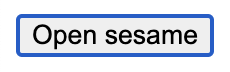 |
Improving and ensuring the existence of focus indicators across all interactive elements in the PyData theme was a major part of the accessibility work we did in the past six months. There were lots of places where focus rings were missing, incomplete, had low contrast, or just didn't look good. In this section, I've rounded up and grouped several examples to show-and-tell the before-and-after difference.
Missing focus rings
The most important kind of before-and-after fix that we made was to add focus
rings to places where they were missing. Now, you might wonder why there were
missing focus rings to begin with, since the browser provides them by default.
My best guess is that the focus rings were removed to fix some other issue and
were never restored because their importance was not appreciated. So it bears
repeating here: in your own CSS, be very careful about setting outline: none
on any keyboard-focusable element because that will turn off the browser's
default focus ring.
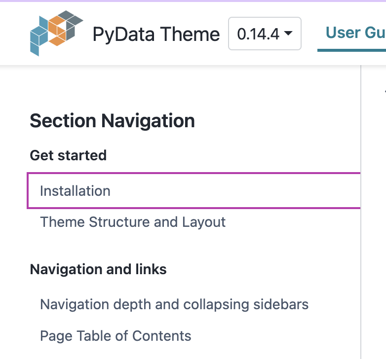
I don't have a full inventory of all the places missing focus indicators, but there were at least seven. Here are screenshots of two such places where focus rings were previously missing:
Inaccessible or broken focus rings
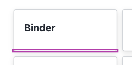
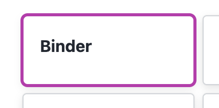
In some places there were focus rings that were broken or did not meet accessibility guidelines. Here are two examples. In one, the focus ring doesn't have sufficient contrast with the background. In the other, there is a bug with the focus ring; it is squished and does not contain the focussed element.
| Before: In-page table of contents | After: In-page table of contents |
|---|---|
 |  |
| Before: Gallery tile | After: Gallery tile |
|---|---|
 |  |
Frankenstates
My colleague Smera Goel, while working through the focus ring designs, coined a term that I find helpful when talking about the challenge of harmonizing several kinds of indicators on the same element. For example, a link can have a hover state, a focus state, a visited state, a non-visited state, an active state (when you are actively clicking it), and a current state (if you're on the page that the link goes to). Many of these states can overlap. For example, a link can be hovered and focussed simultaneously using the mouse and keyboard together. This overlapping state is what we call a frankenstate. It's challenging to design base states in such a way that the frankenstates also look good. It's even more of a challenge if your design process is access-centered. In many design systems, a lot of state differences are conveyed through color alone. A previously visited link might be purple, an unvisited link blue, an active link green. However, an access-centered designer is wary of relying on color alone (because of various forms of color blindness and vision impairments). But that removes an entire dimension from the design space, and you end up designing for states and frakenstates in much the same way that you would arrange a tiny apartment: carefully, thoughtfully, creatively, skillfully, and with a willingness to make needed compromises.
| Header nav link: hover + focus + current |
|---|
 |
 |
Polish
There were also a lot of places that needed polish. The main idea here for me is that in my accessibility work my goal is not to just get things to work, but to work well and look good.
| Version switcher | More dropdown | Left sidebar table of contents | Header nav link |
|---|---|---|---|
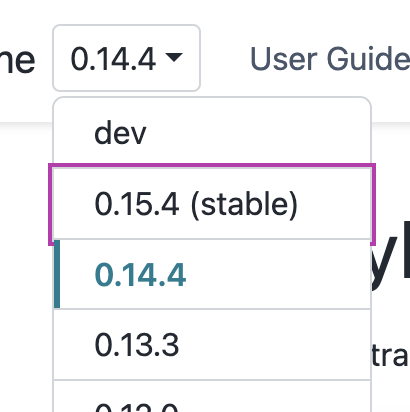 | 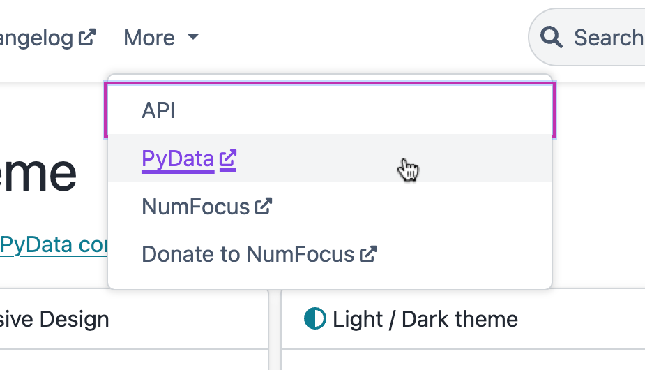 |  |  |
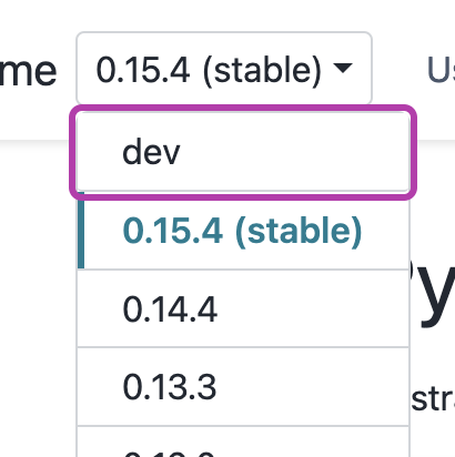 | 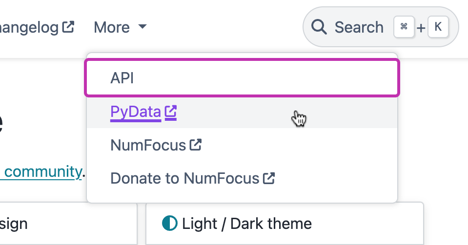 | 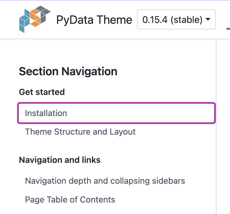 | 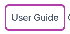 |
There isn't a single GitHub pull request that I can point to in which all of these focus ring issues were fixed. They were done over many weeks and PRs, including but not limited to: #1415, #1555, #1561, #1564, #1582, #1589, #1778.
And more!
This blog post is not meant to capture all of the accessibility work that we did over the past six months, but rather my hope is that I have given you a taste of what this work looks like from my side of things as a developer.
If you would like to take a closer inspection, your best option would be to go to all of the PST issues and PRs tagged with accessibility. If you find anything you would like to read about in a blog post like this one, please let us know! You can contact us at connect@quansight.com.
Accessibility in this Blog Post
Since this is a blog post about accessibility, I think it's worth taking a moment to point out some of the measures I took to make this blog post accessible:
- All images have alt text or are described by the surrounding text (in which case the alt text is an empty string). Even if you cannot see the screenshots in this blog post, you still get the pertinent information because I do not rely on the images alone to tell the story. I try to make sure that all relevant visual information is conveyed through text. There is a real art to this, just as there is with writing, so it's always a learning-and-improving process. The W3C has a fantastic alt text decision tree that can help you.
- All of the links in the blog post are descriptive. If you take a link out of the context of the blog post, it should still give you a good clue about where it will take you.
- The headings are clear and in the right order, with only one level-1 heading
(
<h1>) for the blog post title. - I avoid ableist language (where I am aware of it).
I hope that this blog post has given you an inside look at some of the accessibility work we do here at Quansight Labs, and that you can hopefully apply some of the lessons we have learned. 🌻

